Difficulty: Easy
Read Time: 10 min
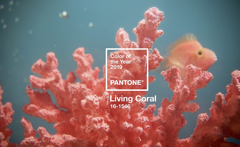
The year 2019 is here and there is no way around progress. As trends in all industries change so do preferred colors. Every year Pantone presents you with their choice for the color of the year.
In 2019 pastel colors are going to be trending again! Pantone embraces this trend by their choice of their color of the year: PANTONE 16-1546 which also goes by the name Living Coral.
The naming reflects a tendency of humans seeking out a balancing component to being constantly immersed into the digital world. It reflects the calmness in life and the energetic part that lies within nature. But also, Living Coral, is supposed to reflect optimism and joyful pursuit of dreams. Which we will all need in the upcoming year.
“…life-affirming color hue with golden undertone…”

Well, the question should be what will you make out of this color, or, how are you going to use it and its intentions in your work?
Being on the edge of industry trends is going to be increasingly important for us creatives. We cannot allow us to be running after trends. So, I urgently want to challenge you with the question what you will make out of this color trend?
Will you remember this trend going forward from today and include it / consider it in your upcoming work? Will you create color styles or presets to deliver your clients with images speaking the same language of optimism as the color of the year 2019? Will your images speak the language of Living Coral?

| CMYK for PANTONE 16-1546 TCX simulation: | C | M | Y | K |
| 0 | 65 | 54 | 0 |
| sRGB under D65 for PANTONE 16-1546 TCX simulation: | R | G | B |
| 255 | 111 | 97 |
| HTML for PANTONE 16-1546 TCX: | FF6F61 |
| CMYK for PANTONE 2345 C simulation: | C | M | Y | K |
| 0 | 59 | 50 | 0 |
| sRGB under D65 for PANTONE 2345 C simulation: | R | G | B |
| 255 | 109 | 112 |
| HTML for PANTONE 2345 C: | FF6D70 |

As an experienced retoucher, you know color palettes exist in many varieties. The simplest ones align along the main hue and are called monochromatic. I find them rather boring. They can have their place and purpose. But if all your color grading game relies on pushing all colors towards one hue, there will be no diversity and your images will look rather boring and lack inspiration. They simply won’t stick out of the mass anymore.
For this reason, I want to give you a few examples of possible palettes. I will leave without comment what the harmonies are based off of but it won’t be monochromatic color harmonies. Maybe, for practice purposes, try to figure out yourself how the hues in these palettes relate to each other. I am curious to find out what you come up with here.


We have prepared five unique color harmonies based on the Pantone Living Coral color for you to download and use as swatches within Photoshop. The swatches can either be used to sample color from or be used as reference colors while working on your images.
[cp_popup display=”inline” style_id=”2851″ step_id = “1”][/cp_popup]
Guide To Accurate Monitor Color Management
Guide To Accurate Browser Color Management