Difficulty: Easy
Read Time: 15 min
Quick Tips
Difficulty: Easy
Read Time: 15 min
Being on the top of your craft means the constant development of skills and to educate yourself on the current trends. You are probably familiar with the phrase that a lack of progress equals decline. And this means being less competitive in a highly competitive and fast-moving market.
As a professional retoucher, you want to be ahead of the game to keep up with high class, high demanding clients.Refining your photoshop skills and techniques is one aspect of continuous education but there are many more skills to our trade. Color is one big important aspect of retouching. I keep telling this over and over again and yet many overlook the power of color wizardry.
And guess what: 2018 is knocking at the door! Many creatives have already started implementing the most recent color trends. And so should you prepare yourself for what will come in the upcoming year.

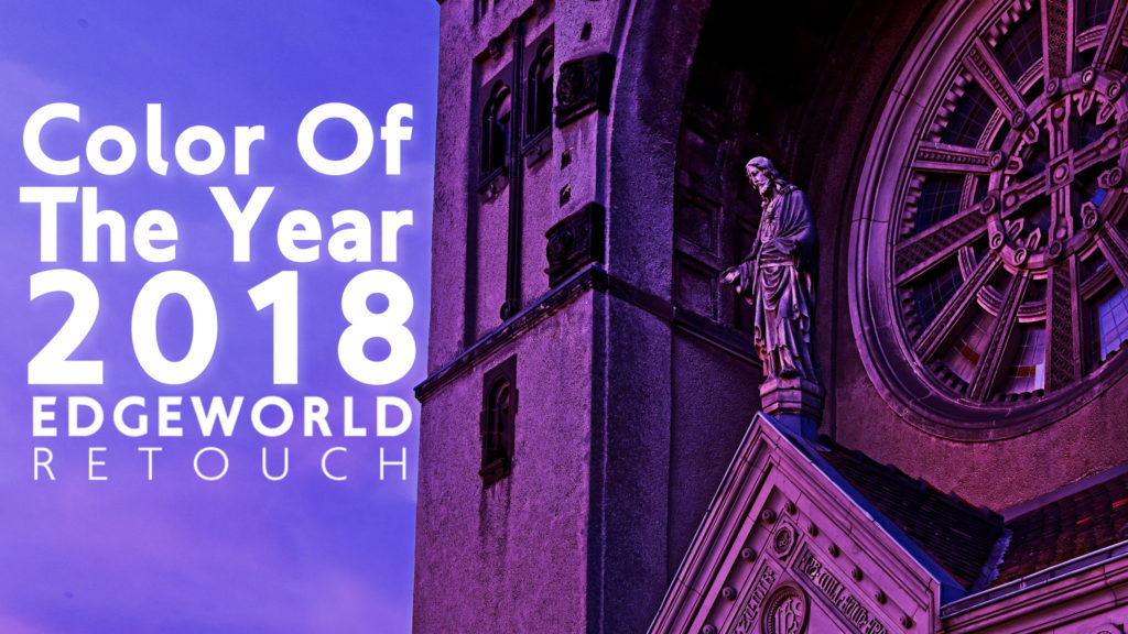
Industry color heavyweight Pantone has announced their color of the year for 2018. Pantone 18-3939 aka UltraViolet.
“The Pantone Color of the Year has come to mean so much more than ‘what’s trending’ in the world of design; it’s truly a reflection of what’s needed in our world today.” – Laurie Pressman, Vice President of the Pantone Color Institute.
Pantone provides colors and color samples used in and across all creative industries. Their goal is to deliver predictable color results. Pantone realizes this task by providing colors for all sorts of printing jobs. The colors come pre-mixed to Pantone’s standards and quality assurance. The Pantone colors also bridge a gap in color management. As reference colors they can be chosen and compared without digital devices and allow matching across a variety of materials.

As you might have guessed, we humans do not see ultraviolet light and therefore no UltraViolet color. The Pantone UltraViolet color is a strong and bold purple color and differs vastly from trending colors over the past few years which have been green, pastel and earthy colors.
Pantone has described their pick of UltraViolet as such: “Ultra Violet suggests the mysteries of the cosmos, the intrigue of what lies ahead, and the discoveries beyond where we are now”
Here are some color Harmonies including the Pantone UltraViolet 18-3838 color.
You can download all these color harmonies as color palettes to use in your favorite Adobe application!


We constantly curate and update on this topic. If you came to search for the color of the year 2019 and want to stay up to date with the current color of the year, check our article on Color Of The Year 2019.
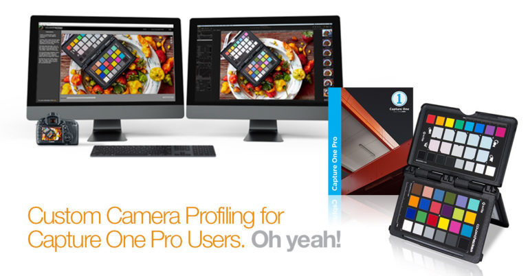
Guide To Accurate Monitor Color
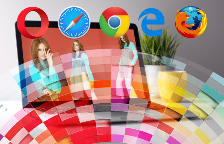
Guide To Accurate Browser Color